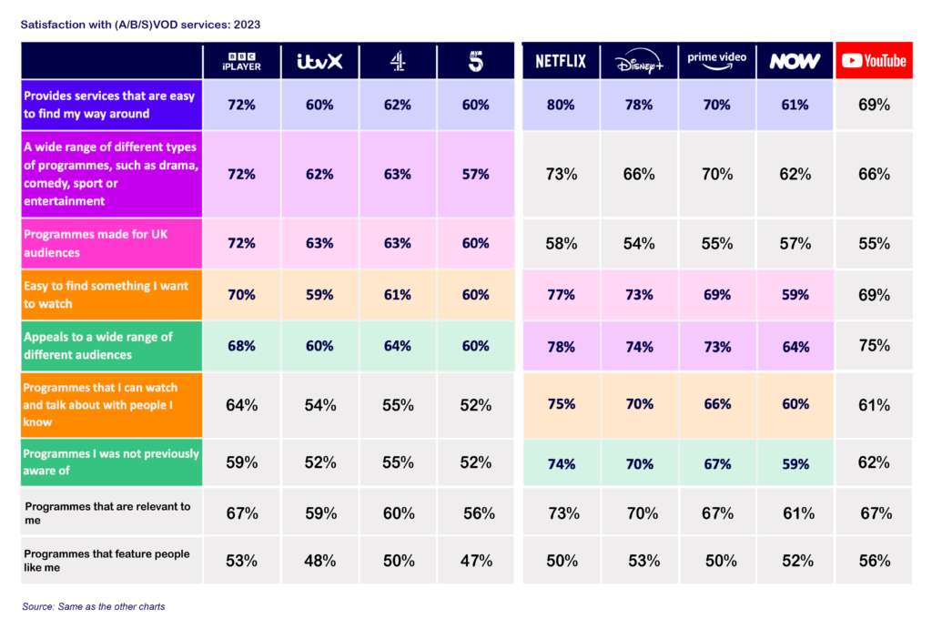
I built this chart by combining VOD (video on demand) data available in Ofcom‘s Media Nations and filling in the blanks from the underlying data.
It’s an interesting comparison, despite the B or S (BS??) variance in VOD type. Though it’s odd to me to have excluded YouTube which also sat in the same dataset.

A couple of thoughts..
- This multiple app route is going to start creating issues as users get tired of switching apps and using various machinations of recommendations and search funcitons to find something to watch,
- I’ve now settled on two or three services which i’ll browse for and generally find something that i’m happy to watch,
- Without a common discovery UI (like the EPG) this will start creating challenges for new entrants to make a successful entry and then grow,
- Freely is clearly a potential answer here depending on how and how far it rolls out. It does make me think of what a short-sighted decision it was to kill Kangaroo all that time ago!
- You can see why YouTube is posing such a threat to TV attention with high satisfaction scores across product and content metrics. Whether it’s ‘broadcast quality’ content or not, audiences are clearly satisfied with it and score it particularly highly for programmes that are relevant to me and featuring people like me.
